
What Material Does It Look Like? Reading a Roll Before You Read the Spec
A hotel operator, a retail buyer and a private-label programme manager can all ask the same question about a roll and mean three different things. This note works through what a fabric looks like in each brief, which visual signals mislead, and where verified bases sit.

PRODUCTS
Products in this report
Three Buyers, One Question, Three Different Answers
A hotel operator walks into a guestroom and asks whether the curtain looks like it belongs to the room. A retail buyer stands three metres from a hanging product and asks whether it looks worth the ticket. A private-label programme manager looks at a base and asks whether it looks like the brand story they have to carry for several seasons. All three are asking what material it looks like. None of them is asking the same question.
That gap is the practical problem behind the phrase. It sounds like a request for a fibre name, but it is usually a request for a visual prediction: will this roll read the way I need it to read in the position it will actually occupy? The answer depends less on the material than on where the cloth is seen from, what light falls on it, and how much surface the room or the shelf can absorb before the fabric starts doing the talking instead of the setting.
What Each End Market Is Actually Buying
A hotel programme buys quietness. The cloth has to sit behind the view, the light and the furniture, and it has to keep doing that after a replacement cycle. A surface that reads as a feature at approval can read as a distraction once forty rooms are dressed the same way. The hotel buyer is not choosing a look so much as choosing a level of visual restraint that survives repetition.
A retail buyer buys a hanging moment. The product has to make its case from the distance a shopper actually stands at, under store lighting, without a salesperson. That rewards surface structure and contrast, because a flat tone at three metres reads as an absence rather than a choice.
A private-label programme buys a base that can change its look without changing its specification. The surface has to accept a future print or colourway, which means the visual question is not only what the roll looks like now but what it will look like after the next artwork lands on it.
The Visual Signals That Mislead
Two rolls can share a weight band, a composition family and a tone, and still read completely differently once they are hung, folded or lit. The signals a buyer can see on a roll are real, but they are not the signals that decide the brief.
A flat sample under a warm lamp flatters almost everything. It hides the uneven light break that a slub produces in a vertical drop, and it hides the way a raised motif flattens where a fold crosses it. Directional surfaces are the clearest case: a vertical channel or a horizontal slub can look identical on a table and opposite on a window, because the eye reads the grain against gravity rather than against the weave.
Metallic accents are the second trap. A silver yarn that catches light deliberately in a feature panel can look like a defect when it is repeated across a whole room, because the eye finds every highlight at once. The material has not changed between those two readings. The viewing condition has.
Where Verified Bases Sit in Each Brief
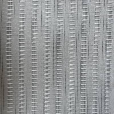
For a hotel brief that needs restraint with a little structure, 27-001-1-A is a useful reference point. It is a vertical-channel polyester-linen at 165 GSM, 93% polyester with 7% linen, and it is printable. The vertical channel gives the drop a quiet line without turning the window into a feature, and the printable status means a future colourway or logo programme does not require a new base. The limitation is direction: a channel surface has to be cut and hung consistently, or the second order will read against the first.
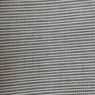
For a retail brief that has to sell from a distance, 27-09-08 is the more honest comparison. It is a 100% polyester ladder-stripe jacquard at 120 GSM, printable, with a raised texture that holds a shadow under store lighting. That raised line is what makes the product read at three metres. The same quality is a limitation in a quiet guestroom, where the stripe competes with the room rather than supporting it.
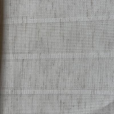
For a private-label brief that needs a base to carry a print, 27-008-3 is a workable starting point: a 130 GSM polyester-linen stripe, 92% polyester with 8% linen, printable, in a natural ivory register. It gives the programme a surface with a visible line and a printable face. The constraint is that a stripe sets a rhythm the artwork has to respect, so the print file and the base have to be developed together rather than in sequence.
What Our Own Search Rows Do and Do Not Show
The query that led here reached curtains.vip once in the last twenty-eight days, with no clicks and a position of one. That is a single row describing our own site, and it is not evidence of market size, market share, growth or any wider trend. We treat it as a question a buyer brought to our catalogue, not as a demand signal.
The useful part is narrower and more practical. A buyer arriving with this phrasing is usually trying to translate a visual impression into a specification, which means the conversation belongs at the sample stage rather than the quotation stage. That is an observation about our own traffic, not a claim about the industry.
The Shortlist Framework Before You Sample
Three questions do most of the work. First, where will the cloth be seen from? A guestroom, a shelf and a folded stack are three different viewing distances, and the surface that reads at one will often disappear at another. Second, what light will it sit under? Cool corridor light, warm retail light and daylight through a window pull the same tone in different directions.
Third, what has to happen to this base after the first order? If the answer involves a print, a colourway or a logo programme, the printable status of the roll is part of the visual decision, not a separate technical one. A base that looks right and cannot carry the next chapter is not a shortlist candidate.
When those three answers are written down, the sample request becomes specific: the exact SKU, the intended position, and the lighting condition it will be judged under. That is the point at which a supplier can respond with evidence rather than a swatch. Shaoxing Haowen Textile Clothing Co., Ltd. (the company behind the curtains.vip team) develops curtain, shower-curtain and table-linen fabrics, including custom print development, so a brief that spans more than one end use can be worked against a single specification conversation. The verified bases are listed on /products, and a sample request can be raised through /contact.
Questions buyers ask
Can two rolls look identical and still behave differently in service?
Yes. Weight, composition and tone can match while the surface direction, the print status and the way the cloth breaks light differ. Those differences usually appear only when the fabric is hung, folded or lit in the position it will occupy, which is why the sample stage matters more than the swatch stage.
Does a printable base look different from a non-printable one?
Not necessarily at arm's length. Print status is a capability, not an appearance. It becomes visible when a future colourway or print programme is applied, which is why a buyer planning more than one season should treat printability as part of the visual shortlist rather than a separate technical check.
How should a buyer describe what they want a fabric to look like?
Describe the viewing position, the lighting condition and the intended life of the base. Those three details let a supplier match a surface to the brief instead of guessing from a photograph, and they make the sample request specific enough to be judged against evidence.