
Neutral Fabric Colour Direction for Contract Interiors: The Greige Trap and Three Ways Out
Neutral is the safest word in a contract brief and the most expensive one to get wrong. This decision memo works through the brief, the trade-offs, the shortlist logic and the validation step behind a neutral fabric colour direction for contract interiors.

PRODUCTS
Products in this report
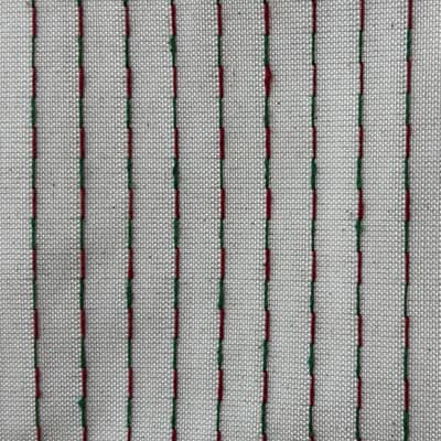
Colour-Yarn Stripe Fabric
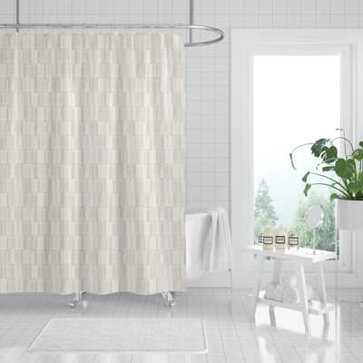
Woven Stripe
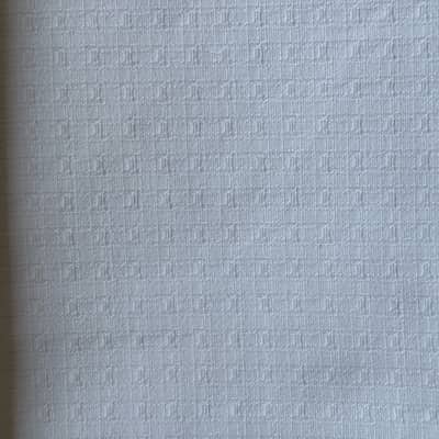
Polyester-Cotton Fine Grid Fabric
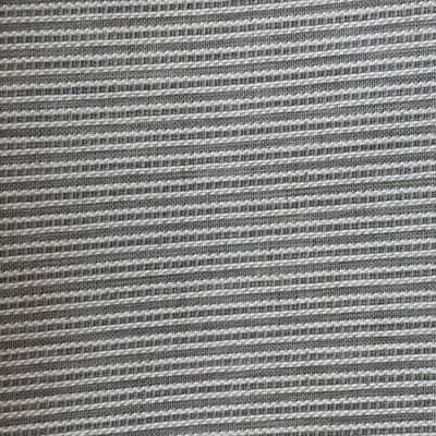
Vertical-Channel Polyester-Linen Fabric
Raised Dash Jacquard Fabric
The Brief That Says Neutral, and the Three Buyers Who Mean Different Things
The brief lands with one line: neutral, warm, nothing that dates. Three people read it. The hotel operator pictures a guestroom that still looks deliberate after the third replacement cycle. The retail category manager pictures a hanging product that reads from three metres under store lighting. The private-label programme manager pictures a base that can carry next season's colourway without a full respecification.
Those are not three versions of the same neutral. They are three different jobs, and the fabric that satisfies one often fails another. The hotel wants a surface that hides handling and reads calm across a corridor. Retail wants a tone that photographs well and separates on a shelf. Private label wants a base quiet enough that a print or a dye lot can move over it.
The decision in front of the desk is not which neutral is prettiest. It is which neutral still does its job when the light, the room and the replacement cycle change. That is what makes neutral fabric colour direction for contract interiors a specification problem rather than a mood board.
Why Greige Collapses First
Greige is the default answer because it photographs as safe. In a sample room under one lamp it reads warm and expensive. The trouble starts when the same tone meets three conditions at once: a cool LED corridor, a large flat wall, and a surface with visible structure.
Under cool light, a warm greige can shift toward a flat putty and lose the depth that made it attractive in the swatch. On a large wall, a tone that looked rich in a hand-sized piece can read thin, because there is no longer a frame around it. And when the surface carries a slub, a grid or a jacquard motif, the structure competes with the tone: the eye reads texture first and colour second, so the neutral you specified is no longer the neutral the guest sees.
None of this is a defect in the fabric. It is a mismatch between the neutral and the room it was chosen for. The practical consequence is that a greige shortlist should be tested on a vertical panel at the project's real light temperature before it is tested on a table.
The Trade-Off Buyers Actually Face: Quiet Tone or Visible Structure
Most contract neutral decisions reduce to one trade-off. A flatter surface holds a tone more predictably and reads calmer across a long run of rooms, but it can look plain in a retail setting where the product has to earn attention from a distance. A structured surface adds depth and hides handling, but it changes how the tone reads and makes the reorder more sensitive to direction and batch.
That trade-off is where verified rolls become useful as evidence rather than as a catalogue. A 155 GSM colour-yarn stripe in 92% polyester and 8% cotton, SKU 27-09-09, is a case where the neutral is carried partly by a woven stripe rather than by a flat dye. The stripe gives the surface a rhythm, which suits a corridor or a feature wall where a plain tone would go flat, but the buyer has to accept that the stripe is now part of the colour direction. It is not printable, so it belongs to programmes where the neutral is the finished statement.
Colour-Yarn Stripe Fabric
Woven Stripe
At the other end, a 190 GSM polyester-cotton fine grid, SKU 27-DS001-C, keeps a soft white tone but adds a small-scale grid that reads as texture up close and as a quiet neutral at a distance. It is printable, which matters if the same base has to carry a later print or a tonal overdye. The trade-off is the opposite of the stripe: the grid is subtle enough to disappear in a large room, which is an advantage in a guestroom and a disadvantage on a retail shelf.
Where a Neutral Has to Be More Than a Tone
Some briefs ask the neutral to do structural work. A vertical channel in 93% polyester and 7% linen, SKU 27-001-1-A at 165 GSM, is a linen-look base where the channel itself creates the light-and-shadow that a flat neutral cannot. In a tall window or a double-height lobby, that structure can carry a room without introducing a colour. In a low, tight space it can read busy, and the neutral stops being neutral.
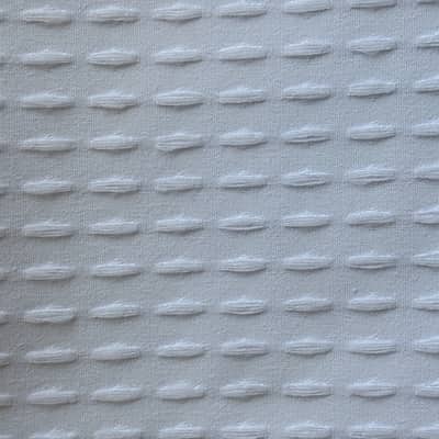
A raised dash jacquard, SKU 27-DS001-F at 185 GSM in 100% polyester, sits in a similar position: the motif is the direction, and the tone is the background. Both are printable, so they can also serve a private-label programme that wants a textured neutral base and a later print. The decision point is whether the room needs the surface to speak or to stay silent.
This is also where the legal entity becomes relevant rather than decorative. Shaoxing Haowen Textile Clothing Co., Ltd. (the company behind the curtains.vip team) develops curtain, shower-curtain and table-linen fabrics, including custom print development and finished shower curtain OEM/ODM, so a neutral chosen for one textile in a project can be checked against the other textiles in the same scheme instead of being sourced in isolation.
What Our Own Signals Show, and What They Do Not
Searches for neutral colour direction in contract interiors have not yet reached curtains.vip in measurable volume. The Search Console rows for this cluster show zero impressions and zero clicks over the last 28 days, so there is no first-party evidence here of demand, ranking or click behaviour. We are not going to dress that up as a trend.
What we can say is narrower and more useful. Neutral direction is a question buyers raise inside a project conversation rather than as a standalone search, which is consistent with the briefs that reach us. That is an observation about our own enquiry pattern, not a market measurement, and it should not be read as evidence of global demand, market size or direction.
The practical implication is that a buyer should not treat any supplier's neutral range as validated by search interest. Validate it against the room, the light and the replacement cycle you actually operate.
The Shortlist Logic Before You Sample
Cut the list by asking what the neutral has to survive. If the programme replaces on a wear cycle and the surface must hide handling across many rooms, favour a flatter or finely structured base and test it on a vertical panel. If the product has to sell from a hanging position under store lighting, favour a surface with enough structure to hold a shadow and test it at three metres. If the base has to carry a later print or a seasonal colourway, favour a printable neutral and test it with the actual artwork.
Only then compare weight, composition and price. A neutral that fails the room test will not be rescued by a better unit price, and a neutral that passes it rarely needs the cheapest roll in the range.
The Rule to Carry Into the Next Brief
If the room is large, the light is cool and the surface is structured, choose the neutral on a vertical panel under that light, not on a table under a warm lamp. If the product must sell from a distance, choose the surface with enough structure to hold a shadow, and accept that the tone will read differently up close. If the base must carry a future print or colourway, choose a printable neutral and validate it with the artwork before the range is committed.
When a neutral shortlist is ready, the next useful step is to compare the rolls on the /products page against the room conditions, then send the project brief through /contact so the sample and the specification can be matched to the same SKU.