
Printed Home Textile Collection Direction: The Ink-to-Base Handoff That Decides a Colourway
A printed home textile collection direction is usually argued in colour. The argument that decides the reorder happens later, where ink meets base. This field note follows a motif from the flat artwork to the folded, hung and re-laid cloth, and ends on the one sample question that settles a colourway.

PRODUCTS
Products in this report
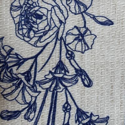
27-001-F Navy Floral Polyester-Linen Fabric
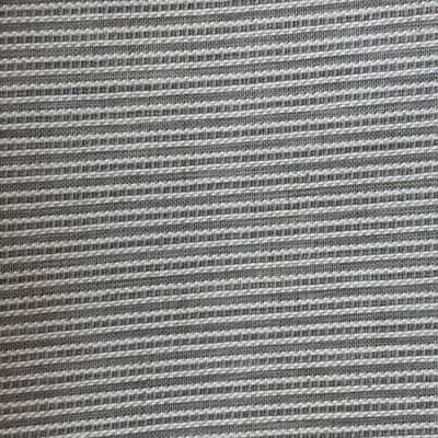
Vertical-Channel Polyester-Linen Fabric
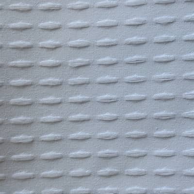
Raised Dash Jacquard Fabric
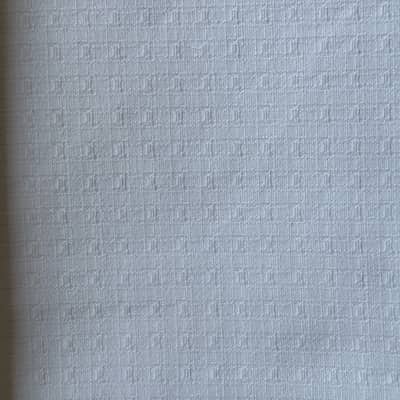
Polyester-Cotton Fine Grid Fabric
The Motif Reads One Way Flat and Another Way Hung
Pin a printed panel flat on a wall and the repeat looks even. Every leaf sits where the artwork placed it, the ground reads as a single tone, and the colourway looks finished. Take the same panel down, hang it in soft folds, and the motif starts to break. Where the cloth turns, the repeat compresses. Where light crosses a fold, one part of the print reads darker than the part beside it. The design has not changed. The viewing condition has.
That shift is the first thing to look at when a printed home textile collection direction is being set, because a collection is not approved flat. It is approved in the position it will occupy: hanging at a window, draped over a table edge, folded on a shelf. A buyer who signs off on a flat panel is signing off on a condition the product will rarely be seen in.
The practical consequence is that direction is not a colour decision first. It is a decision about how much surface the base can carry, how large the repeat can be before a fold interrupts it, and whether the ink sits on the surface or settles into it. Those are construction questions, and they arrive before the palette is finalised.
Where the Ink Actually Meets the Cloth
Print development is often described as an artwork step followed by a production step. In practice the two overlap, because the base decides what the artwork can do. A slubby ground breaks a fine line. A dense flat ground holds it. A raised jacquard structure lifts some areas of the motif and leaves others recessed, so a single colour can read as two tones under one light.
This is why print compatibility is a product-specific fact rather than a general property of a fibre. Two rolls can share a composition and a weight band and still behave differently under the same file. One accepts ink across the whole surface; the other does not, and no adjustment to the artwork changes that.
For a collection, the useful question is not whether a base is printable in the abstract. It is whether the specific base shortlisted for the specific colourway has been printed with the actual motif and viewed in the actual position. A generic swatch proves the process exists. It does not prove the direction works.
Four Bases, Four Different Answers to the Same File
The verified range makes the trade-off concrete, and the differences are structural rather than cosmetic.
27-001-F-PRINT is a 150 GSM printed polyester-linen at 92% polyester and 8% linen, supplied as a navy floral. It is the clearest case of a base already carrying a motif: the print status is confirmed, the linen content gives the ground a faint irregularity, and the floral repeat is the kind of design that gains from a slightly uneven surface rather than fighting it.
27-001-1-A sits at 165 GSM in 93% polyester and 7% linen, built with a vertical channel structure and printable. The channel runs in one direction, which matters for a collection because a directional ground and a directional motif can either reinforce each other or compete. A vertical repeat over a vertical channel reads as one movement. A motif that runs across the channel reads as two.
27-DS001-F is a 185 GSM 100% polyester raised dash jacquard, printable. Here the surface is already doing work before any ink arrives, so a colourway has to be judged against a structure that will not sit flat. 27-DS001-C, at 190 GSM in 88% polyester and 12% cotton with a fine grid, is printable and quieter, which makes it the more forgiving ground for a fine-line or small-scale repeat.
Raised Dash Jacquard Fabric
Polyester-Cotton Fine Grid Fabric
None of these four is a default. They are four different answers to the same file, and the collection direction changes depending on which one is chosen.
What Has to Be Measured Before the Colourway Is Fixed
Once the base is shortlisted, the direction stops being a design conversation and becomes a specification. Three things have to be settled, and each one belongs to a different stage of the order.
The first is repeat scale against fold and drape. A motif that is legible flat can lose its read where the cloth turns, so the repeat has to be judged at the size it will actually appear and in the position it will actually occupy.
The second is the ground's own variation. A slub, a channel or a raised structure introduces a second pattern underneath the print. That is not a defect, but it has to be accepted deliberately rather than discovered at the second order, because it is the part of the surface that will be hardest to reproduce identically.
The third is the reference panel. Whatever is approved has to be retained from the approved roll, because the next delivery will be compared against memory otherwise. A printed collection that cannot be compared panel-to-panel across seasons is not a collection yet; it is a series of separate purchases.
Where a programme needs to test a colourway across a single retail door or one property before committing, the usual reference MOQ of 2,000 m per SKU applies, and orders below that are accepted with a slightly higher unit price. That is a pilot mechanism, not a restriction, and it is worth using before a direction is locked across a full range. The usual reference MOQ is 2,000 m per SKU; orders below 2,000 m are also accepted, with a slightly higher unit price.
What Our Own Search Rows Do and Do Not Show
The keyword behind this note has reached curtains.vip with no recorded impressions or clicks in the period we can see. That is a statement about our own site, not about the market. A term with no measurable traffic on one catalogue tells us the phrasing is not yet how buyers arrive at our pages. It does not tell us the direction is small, growing, or declining, and we do not treat it as evidence of any of those things.
What the row is useful for is narrower and still practical: it flags a phrase we should be able to answer well when a buyer does use it. The questions that sit underneath it — how large a repeat can be before a fold breaks it, whether a structured ground can carry a fine line, which base holds a colourway across a reorder — are the ones buyers bring to us in other words. Those are answerable from construction facts. Market size is not, and we leave it alone.
Where the Direction Is Actually Decided
A printed collection direction is usually written as a palette plus a set of motifs. The version that survives contact with production is written as a base plus a repeat scale plus a retained reference panel. The palette follows from those three, not the other way round.
This is also where the commercial structure matters. Shaoxing Haowen Textile Clothing Co., Ltd. (the company behind the curtains.vip team) develops curtain, shower-curtain and table-linen fabrics, including custom print development and finished shower curtain OEM/ODM, which means a single collection can be worked across the three end uses against one print-development conversation rather than three.
For a buyer, the useful action is to shortlist two or three bases from the range, send the actual motif rather than a description of it, and ask for the print on each base viewed in the position the product will occupy. The verified fabrics sit on /products, and a specification conversation can start at /contact. The point of the exercise is not to collect swatches. It is to find out which base makes the direction repeatable.
Questions buyers ask
Should a printed home textile collection be built on one base or several?
Several, if the collection spans more than one end use. A hanging curtain, a tablecloth that spends its life folded, and a shower curtain are viewed under different conditions, and a motif that reads well on one surface can compress or lose legibility on another. The practical constraint is print concentration: if only one base in the range is printable, every future colourway depends on that single SKU, which is a reorder risk worth pricing rather than discovering at the second season.
Does a structured ground make a print harder to control?
It makes it different, not automatically harder. A raised jacquard or a vertical channel introduces a second pattern underneath the motif, so the surface will never read as flat, and that has to be accepted deliberately. The test is whether the structure reinforces the direction of the motif or competes with it. A vertical repeat over a vertical channel reads as one movement; a motif running across the channel reads as two.
What should be retained from an approved printed roll?
A reference panel from the approved roll, kept for comparison against the next delivery. Without it, the second order is judged against memory, and memory is unreliable where a ground carries slub, channel or raised structure. The panel is the only like-for-like comparison available once the original sample has left the sample room.